Your competitors have mobile friendly web sites.
Do You? – If not – Get One.
12 Reasons Why You Should Have a Mobile Friendly Website
Back in 2012 when we discussed about free awesome tools that help to build a mobile website, we obviously knew how important it is to have a mobile friendly website. We have even shared some statistics to prove our point in that article.
At the present day, when we are almost reaching the end of 2014, some early surveys in the year suggest that only six percent of the website owning SMB population in the U.S. and U.K. have mobile sites. These numbers only goes to show that many businesses around the world have not yet been convinced enough to create a mobile website or optimize their existing website for mobile.
Hence, we have decided to list 12 highly significant reasons that a business or an individual who has customers online must consider before saying no to a mobile friendly website.
1 – Mobile Surpasses Desktop Shopping Activity
According to comScore, a leading internet technology company, 55 percent of all time spent on online shopping in June 2013 was on a mobile device. Out of the 55 percent mobile devices, 44 percent was from a smartphone while the remaining 11 percent was from a tablet device. The rest of the 45 percent shopping activity occurred on desktops and laptops.
A much recent report from The Guardian UK states that 52 percent visits to online retail sites were from mobile devices and 36 percent purchases were made from them too. Out of the sales completed on a mobile device, 18 percent occurred on a smartphone while 82 percent occurred on a tablet.
Important Takeaway:
If you have an online retail store, make sure your site adapts to the screens of a smartphone and also that of a tablet device. Use device emulators or operating system simulators to test the mobile rendering of your site.
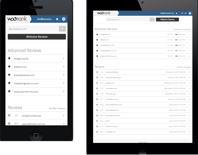
Woorank Website On iPhone 5 and iPad Mini
2 – One-Third Online Traffic Is Mobile
According to a marketing and publishing firm called Walker Sands Communication’s, 31.3 percent of the global internet traffic to North American websites was from smartphones and tablets in the fourth quarter of 2013. It was a substantial increase from the 23.4 percent in the fourth quarter of 2012.
A Kleinger Perkins Caufield & Byers (KPCB) 2013 internet
trends report proves a constant and rapid growth in mobile traffi, as
shown below:¡
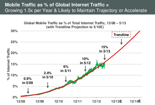
Growing Mobile Traffic Over The Years
The same study also highlights the fact that the mobile traffic on Android smartphones at 45.6 percent which was closely followed by iPhone at 32 percent and iPad at 13.9 percent. There was comparatively low mobile traffic stats reported on Android tablet at 4 percent, Blackberry at 0.8 percent and other mobile devices accounting together to 3.7 percent.
Important Takeaway:
Owing to the rapidly increasing numbers of mobile traffic among global internet traffic, it is highly possible that if you do not have a mobile friendly website, you are leading your potential mobile traffic to a competitor site.
If you do not currently have a mobile site and want to start off with a basic mobile friendly site, at least make sure that your site renders to the screen size and functionality of mobile devices using Android and iOS operating systems.
3 – Mobile Friendly Sites Benefit Local Business
If you have a local business, you must know that around 50 percent consumers who conducted a smartphone search for a local store, visited the store within 24 hours, according to a study from Google.
On the other hand, the same activity was performed by only 34 percent of consumers who searched on a desktop or tablet device.
18 percent of a local search on smartphones leads to a sale as compared to non-local searches that account for 7 percent.
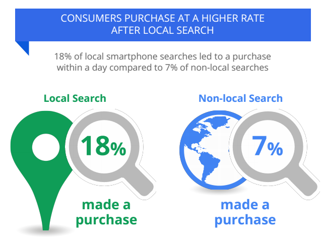
Sales From Local And Non-Local Smartphone Searches
Important Takeaway:
If you have a local business, and although you depend on word-of-mouth marketing for your business, you must be aware of the changing mobile behavior of your local customers too. As evident from the study above, you must take into consideration the increasing smartphone use in finding a local business and thus design a mobile website that facilitates it.
Among the type of local information sought on a mobile device finding business hours, finding directions to store and locating the store address are the three actions frequently undertaken on mobile than on desktop. Shown below are the stats from the same Google study mentioned previously.
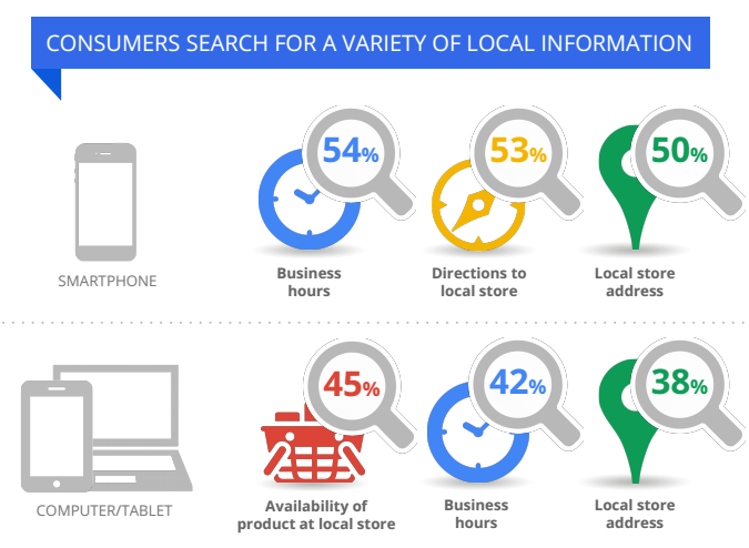
Variety Of Local Information Sought On Mobile Vs Desktop
4 – Wide Range Of Demographics Own Smartphones
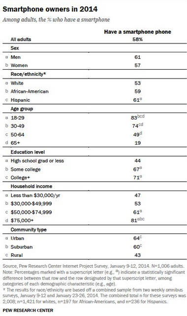
Smartphone Owners Statistic 2014
Important Takeaway:
A wide range of demographics own a smartphone with the easy internet access in their hands. What age group do your primary customers fall in? Looking at the numbers above, if your major clientele lies in the U.S. you ought to have a mobile friendly site for your users.
5 – Time Spent On Mobile Is More Than Other Traditional Media Devices
According to eMarketer’s research made earlier this year, the average time spent by an U.S. adult on television is on a consistent decline from 2010 to 2014. Whereas the time spent on digital mobile devices is on a constant rise. In fact, the study also predicts a decline in the use of desktop with time. Most of the time spent on mobile devices is on social networking sites and for watching videos.
Important Takeaway:
Although we have found that the average adult in a first world nation spends more time on mobile, most of this time is spent on personal activities like social media. This leaves very little time for browsing websites on the smartphones. And as the attention span of users of the internet is very volatile it is important to keep your mobile friendly site’s response times quicker than that of your desktop sites. Here are a few tips to increase the speed of your mobile website.
6 – Google Click-to-Call Feature Extensively Used To Contact Businesses
According to a research from Google and Ipsos, a global market research company, a massive 94 percent have found a need to call a business directly when searhcing for information on their smartphones. This is irrespective of the click-to-call button present in Google search results.
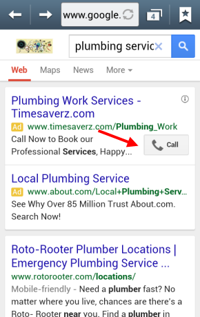
Google Click To Call Feature
Important Takeaway:
This statistic goes to show that smartphone users are looking for a prominent call button on your mobile website. If your business does not show a click-to-call button on Google search a smartphone user will look for calling option in your website.
7 – Mobile Friendly Websites Double Conversion Rates
In a case study, an e-commerce website called A Touch of Class found an incredible improvement in conversion rates and sales after they launched their m-commerce site. The director of information technology of the company confirms that removing the need to pinch and zoom the desktop site on mobile device screens makes a world of difference.
Important Takeaway:
It is not just important that you have a mobile website but it must have mobile friendly elements that makes it easy for your users to perform transactions or get more information in a matter of a few seconds. Here are a few tips for optimizing your mobile site’s landing page.
8 – Increasing Holiday Sales Reported On Mobile Devices
IBM has found that mobile led by iOS finds prominence in holiday e-commerce sales. Mobile traffic accounted to half of site traffic at 52.11 percent in 2014. This is up by 10 percentage of the overall mobile site traffic in 2013 which was 42.57 percent. Mobile sales accounts up to one-third of all online sales. Among the different mobile devices, iPhone and iPad showed more activity than Android phones.
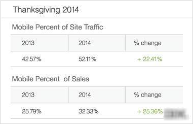 Holiday Mobile Site Traffic And Sales Percentage 2014 By
IBM
Holiday Mobile Site Traffic And Sales Percentage 2014 By
IBM
Also, shown below are the stats from the same study for the percentage of average order value, site traffic and sales on smartphones as compared to tablet devices.
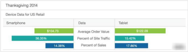 Device Data For US Retail 2014 By IBM
Important Takeaway:
As mentioned earlier in the post, Android and iOS devices are top players when it comes to online shopping. So whether or not your mobile site is friendly in other devices, it must be at its best in iOS and Android devices. Also, the fact that holiday sales are on a constant rise year-by-year on mobile, you must have a mobile-friendly website that attracts your holiday shoppers.
9 – Easy Access To Company Information While On the Go
Owing to the stats shown above, you know by now that smartphones have become an integral part of an average person’s lifestyle. So, it goes without saying that your site is probably being accessed while at work or in transit or even while strolling down the sidewalk. There are many hindrances such as internet speed and not being able to focus 100 percent on a given task on the mobile device.
Important Takeaway:
Limit your website to only information that will immediately help the user take an action. Give users mobile friendly websites that are easy to access even with all possible hindrances while browsing.
For instance, you can lose the sliding carousels and instead use the space above-the-fold to place call-to-action that your users are generally looking for in your website. You can also minimize the text and graphics on the mobile website and offer finger-friendly buttons or radio buttons to avoid having the users type on their smaller screens.
10 – Rise In Mobile Advertising Over the Years
According to an IAB report, the mobile display ad revenue has almost doubled from 2013. As the adoption of smartphones and the usage of internet on mobile phones undergo a drastic increase over the years, digital marketers are finding new ways to reach their marketing messages to their customers via mobile search display ads, social network ads and ads on mobile apps.
Important Takeaway:
In order to be early adopters of this rapidly emerging practice of mobile advertising, you need to have a mobile friendly website with a mobile friendly landing page to retain and convert the users that come to your site through these ads.
11 – Mobile App Vs Mobile-Friendly Website
In this modern digital world of marketing where almost everything is going mobile, you probably are aware of the basic difference between a mobile website and a mobile app. As a business, especially if you are starting on a small scale, it is difficult to decide whether to invest on a mobile friendly website or a mobile app.
An average smartphone or tablet user may have limited memory on their mobile device or may not want to disclose personal details by downloading an app of a brand they hardly know. It is generally a practice for people to download apps of brands that are popularly known and are usually recommended by their friends.
Important Takeaway:
If you cannot have both mobile website and a mobile app due to limited funds, it is better to opt for a mobile friendly website that can be easily accessed on all mobile device screen sizes and mobile browsers. You must make sure that your mobile-friendly website includes functions usually accessible on mobile apps, such as the call button, easy checkout and payment processes, ability to get directions using a map and social sharing options.
12 – Social Mobile Audience
47 percent of smartphone owners access social media on their phones, either using an app or the mobile web, according to a Nielson 2014 Digital Consumer Report. Mobile devices are driving the growth in social media as social media app usage increases every year.
Important Takeaway:
Social media pages such as Facebook often show you suggested post or suggested pages depending on the user’s interest. It may also so happen that your brand advocates have shared your URL on social media sites and eventually that message has reached out to more of your potential target audience.
As most of these messages are accessed on mobile devices, the links contained in these messages that lead to your website, is also accessed on the smaller screens. Hence, to not lose your social mobile audience’s interest, you must have a mobile friendly website.
Now, what’s your excuse for not having a mobile friendly website? The sooner you build a user-friendly website in favor of your mobile audience, the greater your brand reputation will be.
Let us know in comments if you have a mobile friendly website and what led you to create one.
If you liked this post, you might find interesting these others:
